Website Accessibility for Small Business Owners: What It Is, Why It Matters, and How to Test Your Own Site
If you have never heard the term "web accessibility," you are in the large majority. Most small business owners have not, which is a problem, because an inaccessible website quietly turns away paying customers and, increasingly, invites lawsuits. The good news is that you can understand the basics in a few minutes and test your own site for free this afternoon. Here is the plain-English version.
What "Accessibility" Actually Means
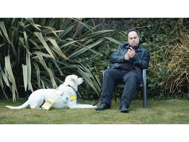
Web accessibility, often shortened to "a11y" (an "a", then 11 letters, then a "y"), simply means: can everyone use your website, including people with disabilities? That covers people who are blind or low-vision and use a screen reader that reads the page aloud, people who are deaf and need captions, people who cannot use a mouse and navigate with a keyboard, and people with motor or cognitive differences. If your site only works for someone with perfect vision, a steady hand, and a mouse, you have built it for a narrower audience than you think.
Why This Is a Business Problem, Not Just a Feel-Good One
It is genuinely the right thing to do, and we will not pretend otherwise. But you do not have to rely on goodwill to justify it, because the dollars-and-cents case is strong on its own.
You are turning away real customers
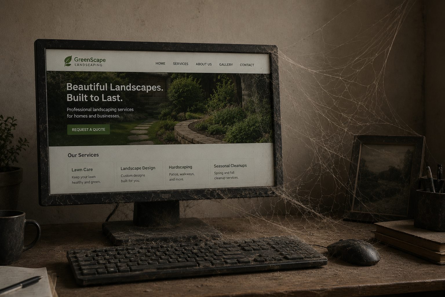
About one in four U.S. adults lives with some kind of disability, according to the CDC. That is a huge slice of your potential market, and they have money to spend. When a blind customer's screen reader hits a "Book Now" button that announces only "button," or a low-vision customer cannot read your pale-gray text, they do not email you to complain. They leave and hire the competitor whose site worked. And this is not a rare edge case: WebAIM's 2025 study of the top million home pages found that 94.8 percent had detectable accessibility failures, with low-contrast text and missing image descriptions topping the list. Most sites are quietly leaking these customers right now.
The legal exposure is real, and it is not the wheelchair-ramp situation you might be picturing
This is the part that surprises owners. Website accessibility lawsuits under the Americans with Disabilities Act have become a genuine wave. Roughly 3,900 of these suits were filed in 2025, up about 24 percent over the prior year, and a large share targeted small and mid-sized businesses rather than only the big chains. The 2019 case against Domino's, over an app and website a blind customer could not use, went all the way to the Supreme Court, which let the ruling stand and effectively confirmed that the ADA reaches websites.
The cases almost never involve a physical ramp or a door width. They come from the digital equivalents: missing alt text, poor color contrast, unlabeled buttons, and checkout or booking flows that a screen reader cannot complete. Settlements commonly land in the range of five to seventy-five thousand dollars, before you add attorney fees and the cost of fixing the site anyway. One more trap worth knowing: many owners buy a cheap "accessibility widget" or overlay that promises instant compliance, and those do not deliver. In 2025 the Federal Trade Commission reached a one-million-dollar settlement with the overlay vendor accessiBe for marketing its tool as a guaranteed fix when it was not. A widget is not a substitute for a site that actually works. (None of this is legal advice. If you are worried about your specific exposure, talk to an attorney who handles ADA accessibility.)
It also helps everyone else, including Google
The same things that help a screen reader help a stressed parent on a cracked phone screen in bright sunlight. Captions help people watching in a quiet office. Clear structure and good contrast make the site easier for everyone, and the underlying clean markup is the same foundation that helps you rank.
What WCAG AA Is, in One Paragraph
When people talk about accessibility "standards," they almost always mean the Web Content Accessibility Guidelines (WCAG), at conformance Level AA. It is the checklist the whole industry uses, and the one courts and regulators point to when they evaluate a complaint. You do not need to memorize it. You just need to know that "WCAG 2.1 AA" is the bar, and that the testing below is how you find out whether you are close to clearing it.
See It in Action
Before you test your own site, it helps to see why any of this matters. This short video from the World Wide Web Consortium shows real people using the web in ways you may never have watched before, and it makes the whole idea click in about seven minutes.
W3C "Web Accessibility Perspectives"
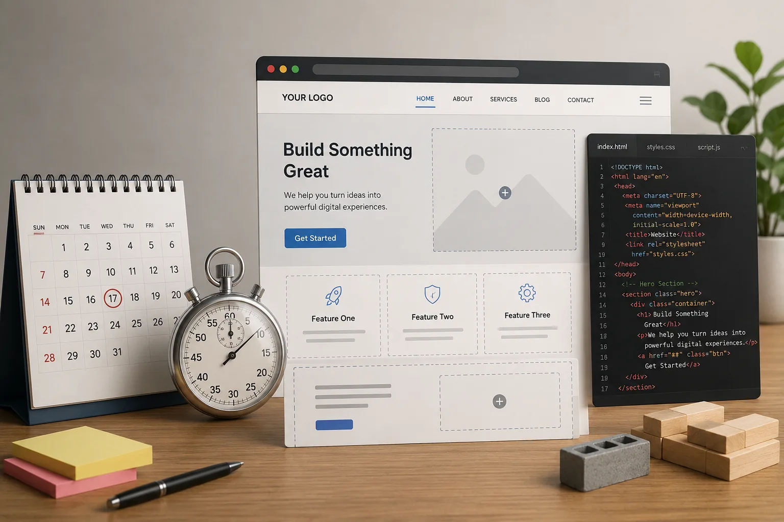
How to Test Your Own Website, Free
You do not need to hire anyone to get a strong first read on your site. You need about thirty minutes and your own phone and computer. Start with the exercise that makes everything obvious, then move to the tools.
The eyes-closed test
Pull up your website, close your eyes, and try to actually use it. With your eyes shut, try to find your phone number and call it. Try to book an appointment or submit your contact form. Try to get from the homepage to your main service. If you cannot do those things without peeking, neither can a customer who relies on a screen reader. It feels silly for about ten seconds, and then it becomes the most useful test you will run all week.
Turn on a screen reader and try it for real
Your phone already has one built in. Turning it on is the single best way to experience your site the way a blind customer does.
On an iPhone, say "Hey Siri, turn on VoiceOver," or go to Settings > Accessibility > VoiceOver and switch it on. Once it is on, touch the screen and it reads whatever is under your finger, you swipe right or left to move between items, and you double-tap anywhere to activate the item it last named. On Android, go to Settings > Accessibility > TalkBack and turn it on (or say "Hey Google, turn on TalkBack"), and the gestures work much the same way. To switch it back off, just reverse the step, or ask Siri or Google to turn it off.
Fair warning: it will feel disorienting and slow at first. That feeling is the point. It is a small taste of navigating the web every day with one, and it tells you instantly where your site helps and where it abandons people.
Test the keyboard on your desktop
On your computer, put the mouse aside and use only the keyboard. Press Tab to move forward through links and buttons, Shift + Tab to go back, and Enter or the spacebar to activate things. Two questions matter: can you always see where you are, with a visible outline or highlight on the focused item, and can you complete your contact or booking form start to finish without ever touching the mouse? If the focus disappears, or you get stuck somewhere you cannot tab out of, that is a real barrier.
Run a couple of free automated checkers
These catch the mechanical problems fast. WAVE lets you paste in a URL and shows accessibility errors right on the page. The Lighthouse Accessibility audit (built into Chrome, also at PageSpeed Insights) gives you a score and a checklist. And the WebAIM Contrast Checker tells you whether your text colors are readable, aim for a contrast ratio of at least 4.5 to 1 for normal text. For a structured walk-through, the W3C's free Easy Checks guide is excellent.
What to Actually Look For
If you have never done this, you will not know what counts as a problem. Here are the things that trip up the most customers, and what "broken" sounds and looks like.
Color contrast. Light-gray text on a white background, or white text on a pale photo, is unreadable for a lot of people. The contrast checker gives you a pass or fail in seconds.
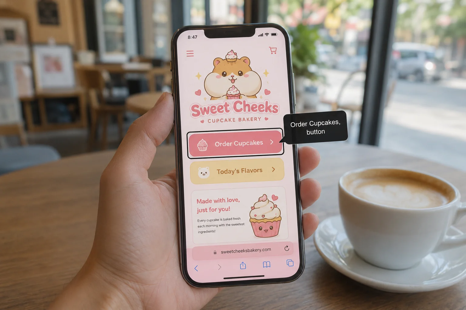
Image descriptions (alt text). With the screen reader on, do your images get described in a way that means something? If a photo is announced as "image," or as a filename like "IMG_4821.jpg," that is a fail. Meaningful images need a short, real description.
Button and link labels. A button should announce its job, like "Book appointment, button," not just "button." Links should say where they go, so "Call us" or "View pricing," never a row of "click here" links that all sound identical out of context.
Form labels. Every field in your contact or booking form should be announced with its name (Name, Email, Phone), and errors should be spoken, not shown only as a red outline a blind user cannot see.
Tap targets. On a phone, buttons and links that are tiny or crammed together are hard for anyone with shaky hands, and frustrating for everyone else.
The fastest way to surface all of this is to run the same few real flows with your eyes closed or the screen reader on: book an appointment, find and call the phone number, open the menu and reach a specific page, and complete the contact form. If any one of those falls apart, you have found something worth fixing, and you have probably found why a customer or two slipped away.
Frequently Asked Questions
Can a small business really get sued over website accessibility?
Yes. Thousands of these lawsuits are filed every year, and many target small and mid-sized businesses, not just large chains. The claims center on digital barriers like missing alt text, low contrast, and booking or checkout flows a screen reader cannot complete. It is worth taking seriously even if you are small.
Will an "accessibility widget" or overlay make my site compliant?
No. These bolt-on tools are widely criticized by accessibility experts, and many do little or nothing for the people they claim to help. The FTC even fined one major overlay vendor for marketing it as a guaranteed fix. Real accessibility comes from how the site is built, not from a script you paste on top of a broken one.
Does passing an automated checker mean I am accessible?
Not entirely. Automated tools like WAVE and Lighthouse catch only a portion of issues, commonly estimated at around a third to half, because many problems need a human to judge. A clean automated scan plus the eyes-closed and screen-reader tests above gets you much closer to the truth than any single tool.
What is the difference between accessibility and just having a "mobile-friendly" site?
Mobile-friendly means the layout adapts to a phone screen. Accessible means people with disabilities can actually use it, on any device. A site can look great on mobile and still be impossible to use with a screen reader. They are related but separate goals.
What is the cheapest, highest-impact fix I can make today?
Fix your color contrast and add real alt text to your images. Those two issues are the most common accessibility failures on the entire web, they are usually quick to correct, and they remove barriers for a large share of affected visitors.
If you run these tests and find a wall of problems, that is genuinely worth addressing, both for the customers you are losing and for the liability you are carrying. We build sites to meet WCAG AA from the start, and we are glad to run a proper accessibility review of your current one and tell you, plainly, where it stands and what it would take to fix. Reach out whenever you want a clear read.
Website Accessibility for Small Business Owners: What It Is, Why It Matters, and How to Test Your Own Site
If you have never heard the term "web accessibility," you are in the large majority. Most small business owners have not, which is a problem, because an inaccessible website quietly turns away paying customers and, increasingly, invites lawsuits. The good news is that you can understand the basics in a few minutes and test your own site for free this afternoon. Here is the plain-English version.
What "Accessibility" Actually Means
Web accessibility, often shortened to "a11y" (an "a", then 11 letters, then a "y"), simply means: can everyone use your website, including people with disabilities? That covers people who are blind or low-vision and use a screen reader that reads the page aloud, people who are deaf and need captions, people who cannot use a mouse and navigate with a keyboard, and people with motor or cognitive differences. If your site only works for someone with perfect vision, a steady hand, and a mouse, you have built it for a narrower audience than you think.
Why This Is a Business Problem, Not Just a Feel-Good One
It is genuinely the right thing to do, and we will not pretend otherwise. But you do not have to rely on goodwill to justify it, because the dollars-and-cents case is strong on its own.
You are turning away real customers
About one in four U.S. adults lives with some kind of disability, according to the CDC. That is a huge slice of your potential market, and they have money to spend. When a blind customer's screen reader hits a "Book Now" button that announces only "button," or a low-vision customer cannot read your pale-gray text, they do not email you to complain. They leave and hire the competitor whose site worked. And this is not a rare edge case: WebAIM's 2025 study of the top million home pages found that 94.8 percent had detectable accessibility failures, with low-contrast text and missing image descriptions topping the list. Most sites are quietly leaking these customers right now.
The legal exposure is real, and it is not the wheelchair-ramp situation you might be picturing
This is the part that surprises owners. Website accessibility lawsuits under the Americans with Disabilities Act have become a genuine wave. Roughly 3,900 of these suits were filed in 2025, up about 24 percent over the prior year, and a large share targeted small and mid-sized businesses rather than only the big chains. The 2019 case against Domino's, over an app and website a blind customer could not use, went all the way to the Supreme Court, which let the ruling stand and effectively confirmed that the ADA reaches websites.
The cases almost never involve a physical ramp or a door width. They come from the digital equivalents: missing alt text, poor color contrast, unlabeled buttons, and checkout or booking flows that a screen reader cannot complete. Settlements commonly land in the range of five to seventy-five thousand dollars, before you add attorney fees and the cost of fixing the site anyway. One more trap worth knowing: many owners buy a cheap "accessibility widget" or overlay that promises instant compliance, and those do not deliver. In 2025 the Federal Trade Commission reached a one-million-dollar settlement with the overlay vendor accessiBe for marketing its tool as a guaranteed fix when it was not. A widget is not a substitute for a site that actually works. (None of this is legal advice. If you are worried about your specific exposure, talk to an attorney who handles ADA accessibility.)
It also helps everyone else, including Google
The same things that help a screen reader help a stressed parent on a cracked phone screen in bright sunlight. Captions help people watching in a quiet office. Clear structure and good contrast make the site easier for everyone, and the underlying clean markup is the same foundation that helps you rank.
What WCAG AA Is, in One Paragraph
When people talk about accessibility "standards," they almost always mean the Web Content Accessibility Guidelines (WCAG), at conformance Level AA. It is the checklist the whole industry uses, and the one courts and regulators point to when they evaluate a complaint. You do not need to memorize it. You just need to know that "WCAG 2.1 AA" is the bar, and that the testing below is how you find out whether you are close to clearing it.
See It in Action
Before you test your own site, it helps to see why any of this matters. This short video from the World Wide Web Consortium shows real people using the web in ways you may never have watched before, and it makes the whole idea click in about seven minutes.
W3C "Web Accessibility Perspectives"
How to Test Your Own Website, Free
You do not need to hire anyone to get a strong first read on your site. You need about thirty minutes and your own phone and computer. Start with the exercise that makes everything obvious, then move to the tools.
The eyes-closed test
Pull up your website, close your eyes, and try to actually use it. With your eyes shut, try to find your phone number and call it. Try to book an appointment or submit your contact form. Try to get from the homepage to your main service. If you cannot do those things without peeking, neither can a customer who relies on a screen reader. It feels silly for about ten seconds, and then it becomes the most useful test you will run all week.
Turn on a screen reader and try it for real
Your phone already has one built in. Turning it on is the single best way to experience your site the way a blind customer does.
On an iPhone, say "Hey Siri, turn on VoiceOver," or go to Settings > Accessibility > VoiceOver and switch it on. Once it is on, touch the screen and it reads whatever is under your finger, you swipe right or left to move between items, and you double-tap anywhere to activate the item it last named. On Android, go to Settings > Accessibility > TalkBack and turn it on (or say "Hey Google, turn on TalkBack"), and the gestures work much the same way. To switch it back off, just reverse the step, or ask Siri or Google to turn it off.
Fair warning: it will feel disorienting and slow at first. That feeling is the point. It is a small taste of navigating the web every day with one, and it tells you instantly where your site helps and where it abandons people.
Test the keyboard on your desktop
On your computer, put the mouse aside and use only the keyboard. Press Tab to move forward through links and buttons, Shift + Tab to go back, and Enter or the spacebar to activate things. Two questions matter: can you always see where you are, with a visible outline or highlight on the focused item, and can you complete your contact or booking form start to finish without ever touching the mouse? If the focus disappears, or you get stuck somewhere you cannot tab out of, that is a real barrier.
Run a couple of free automated checkers
These catch the mechanical problems fast. WAVE lets you paste in a URL and shows accessibility errors right on the page. The Lighthouse Accessibility audit (built into Chrome, also at PageSpeed Insights) gives you a score and a checklist. And the WebAIM Contrast Checker tells you whether your text colors are readable, aim for a contrast ratio of at least 4.5 to 1 for normal text. For a structured walk-through, the W3C's free Easy Checks guide is excellent.
What to Actually Look For
If you have never done this, you will not know what counts as a problem. Here are the things that trip up the most customers, and what "broken" sounds and looks like.
Color contrast. Light-gray text on a white background, or white text on a pale photo, is unreadable for a lot of people. The contrast checker gives you a pass or fail in seconds.
Image descriptions (alt text). With the screen reader on, do your images get described in a way that means something? If a photo is announced as "image," or as a filename like "IMG_4821.jpg," that is a fail. Meaningful images need a short, real description.
Button and link labels. A button should announce its job, like "Book appointment, button," not just "button." Links should say where they go, so "Call us" or "View pricing," never a row of "click here" links that all sound identical out of context.
Form labels. Every field in your contact or booking form should be announced with its name (Name, Email, Phone), and errors should be spoken, not shown only as a red outline a blind user cannot see.
Tap targets. On a phone, buttons and links that are tiny or crammed together are hard for anyone with shaky hands, and frustrating for everyone else.
The fastest way to surface all of this is to run the same few real flows with your eyes closed or the screen reader on: book an appointment, find and call the phone number, open the menu and reach a specific page, and complete the contact form. If any one of those falls apart, you have found something worth fixing, and you have probably found why a customer or two slipped away.
Frequently Asked Questions
Can a small business really get sued over website accessibility?
Yes. Thousands of these lawsuits are filed every year, and many target small and mid-sized businesses, not just large chains. The claims center on digital barriers like missing alt text, low contrast, and booking or checkout flows a screen reader cannot complete. It is worth taking seriously even if you are small.
Will an "accessibility widget" or overlay make my site compliant?
No. These bolt-on tools are widely criticized by accessibility experts, and many do little or nothing for the people they claim to help. The FTC even fined one major overlay vendor for marketing it as a guaranteed fix. Real accessibility comes from how the site is built, not from a script you paste on top of a broken one.
Does passing an automated checker mean I am accessible?
Not entirely. Automated tools like WAVE and Lighthouse catch only a portion of issues, commonly estimated at around a third to half, because many problems need a human to judge. A clean automated scan plus the eyes-closed and screen-reader tests above gets you much closer to the truth than any single tool.
What is the difference between accessibility and just having a "mobile-friendly" site?
Mobile-friendly means the layout adapts to a phone screen. Accessible means people with disabilities can actually use it, on any device. A site can look great on mobile and still be impossible to use with a screen reader. They are related but separate goals.
What is the cheapest, highest-impact fix I can make today?
Fix your color contrast and add real alt text to your images. Those two issues are the most common accessibility failures on the entire web, they are usually quick to correct, and they remove barriers for a large share of affected visitors.
If you run these tests and find a wall of problems, that is genuinely worth addressing, both for the customers you are losing and for the liability you are carrying. We build sites to meet WCAG AA from the start, and we are glad to run a proper accessibility review of your current one and tell you, plainly, where it stands and what it would take to fix. Reach out whenever you want a clear read.