Why Your Website's Stock Photos Are Giving Visitors "the Ick"
Here is a question that comes up more than you would think: why do dentistry ads always show flawless, perfect smiles instead of real patients with real teeth? The answer is revealing. Showing imperfect teeth makes the ad feel like it is about fixing something broken, even though fixing teeth is exactly what dentists do. The image ends up signaling shame instead of care.
That same misfire plays out on small business websites every single day. Your visuals communicate trust, competence, and personality before a visitor reads a single word. When the images, layout, and visual hierarchy are even slightly off, people decide to leave before they reach a sentence. This is less about having a beautiful website than about whether your visuals are quietly saying what you actually mean.
What Customers Decide in the First Few Seconds
People do not read websites. They scan, and the very first thing they take in is visual: the photos, the colors, the density of the layout, and whether anything feels obviously off. Research on first impressions consistently finds that visitors form a visual judgment in under a second, well before they have processed a word of your copy. That judgment has little to do with design taste and everything to do with whether the site feels trustworthy enough to keep reading. A few signals trip people up fastest.
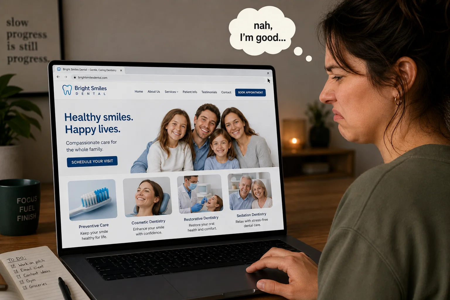
Stock photos that do not match the business
This is the big one. A plumbing company fronted by models in spotless hard hats. A massage practice using generic spa images that could be any hotel chain. An accountant represented by a stock photo of a briefcase on a marble floor. Visitors recognize stock photography, even when they could not name what tipped them off.
The research here is unusually clear. Nielsen Norman Group's eye-tracking studies found that users completely ignore decorative "feel-good" stock images while genuinely studying photos of real people and real work. And Getty Images reported in 2024 that 98 percent of consumers say authentic images and video matter for establishing trust. So stock photos do not just fail to help. They actively work against you, because the moment a first impression feels staged or borrowed, people start quietly wondering what else about the business is fake, and they bounce. Authentic, specific imagery is one of the cheapest credibility upgrades you can make.
Low-resolution or compressed images
A blurry photo communicates one thing above all: nobody is maintaining this. If your image quality looks careless, visitors reasonably assume your service quality might be careless too. This is especially brutal on phones, where a low-resolution hero image fills the entire screen and becomes the whole first impression.
Visual clutter and competing elements
When everything on a page is fighting for attention at once, nothing actually gets it. A cluttered layout feels busy, hard to trust, and hard to act on, and visitors do not patiently sort through visual chaos to find the one thing they need. They leave and try somewhere calmer.
Showing What You Do, Versus Saying What You Mean
The dentistry question is really a deeper one: should your visuals show reality, or aspiration? The honest answer depends on what your customer is feeling when they land on the page.
Someone searching for a dentist is usually a little anxious already. A perfect, intimidating hero smile can quietly raise that anxiety, while a photo of a calm, welcoming office, or a real patient smiling in a way that reads as human, does more to turn that visitor into a booking. The same logic runs across service businesses. A remodeling contractor who shows a messy mid-project shot beside the finished result often builds more credibility than one who only posts glossy "after" photos, because it proves the work is real. A gym that shows actual members lifting, rather than fitness models, feels far more approachable to a nervous beginner.
So the question worth asking of every image on your site is not "does this show what I do?" It is "does this reflect how my customer wants to feel after working with me?" That small shift changes which photos you choose and how you frame them.
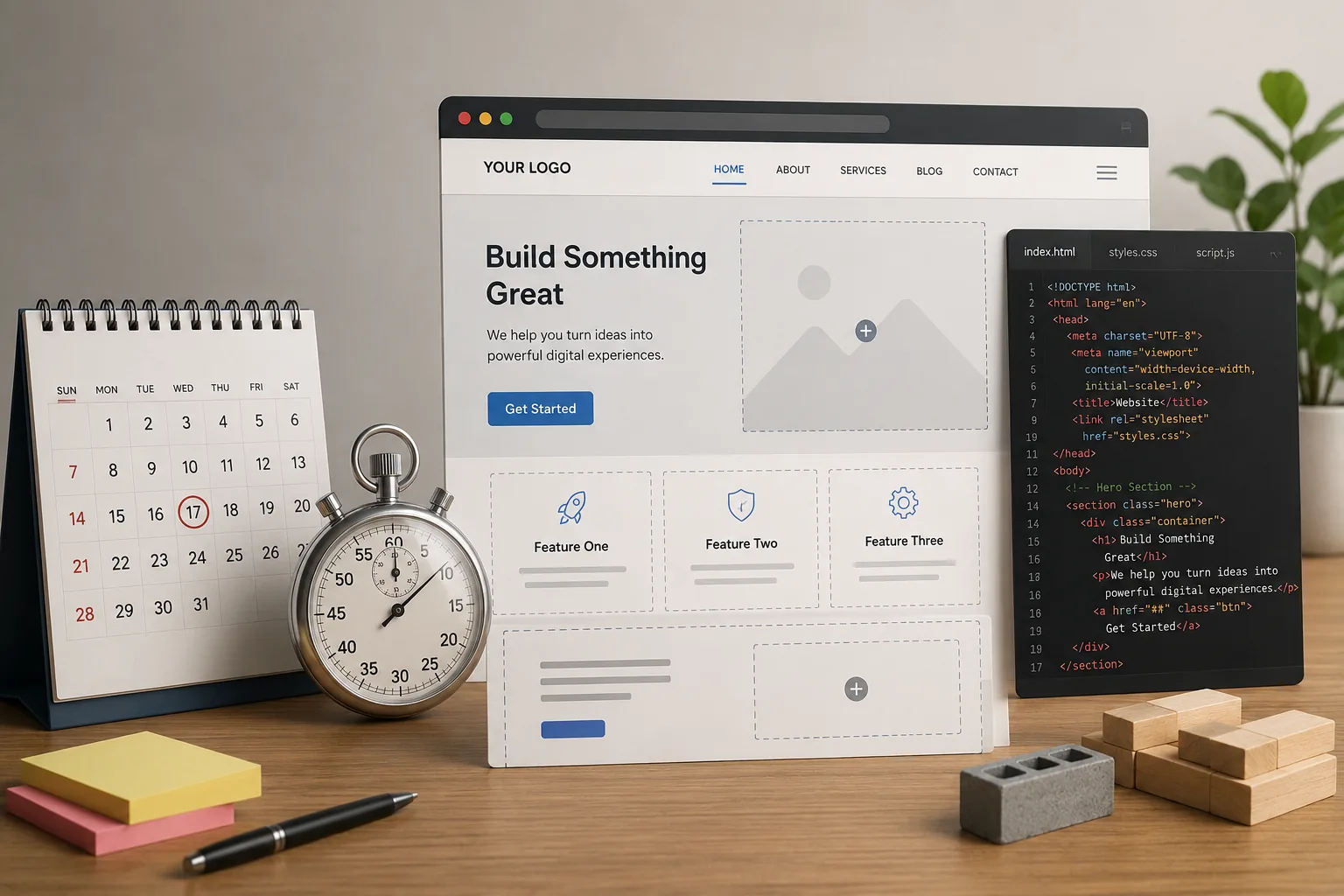
Four Visual Mistakes That Cost You Customers
No human faces anywhere
People connect with people. A site built entirely from products, services, and abstract imagery, with not a single human in sight, reads as corporate and cold. Even one genuine photo of you, your team, or a real customer in the middle of real work measurably warms up a page.
The hero image and headline are fighting each other
The image behind your headline should reinforce the message, not pull against it. A dramatic landscape photo sitting under the words "We do residential plumbing" creates a small disconnect that makes people hesitate, and hesitation is where you lose them. The visual and the words should be telling the same story.
Colors and fonts that signal the wrong industry
Design carries category associations whether you intend it or not. An accountant in neon green with a graffiti-style font signals something very different from steady and trustworthy. A children's tutor wrapped in a dark, corporate palette feels off-limits to parents. These are not hard rules, but when your design language reads as belonging to a different industry, visitors feel the friction even if they cannot name it.
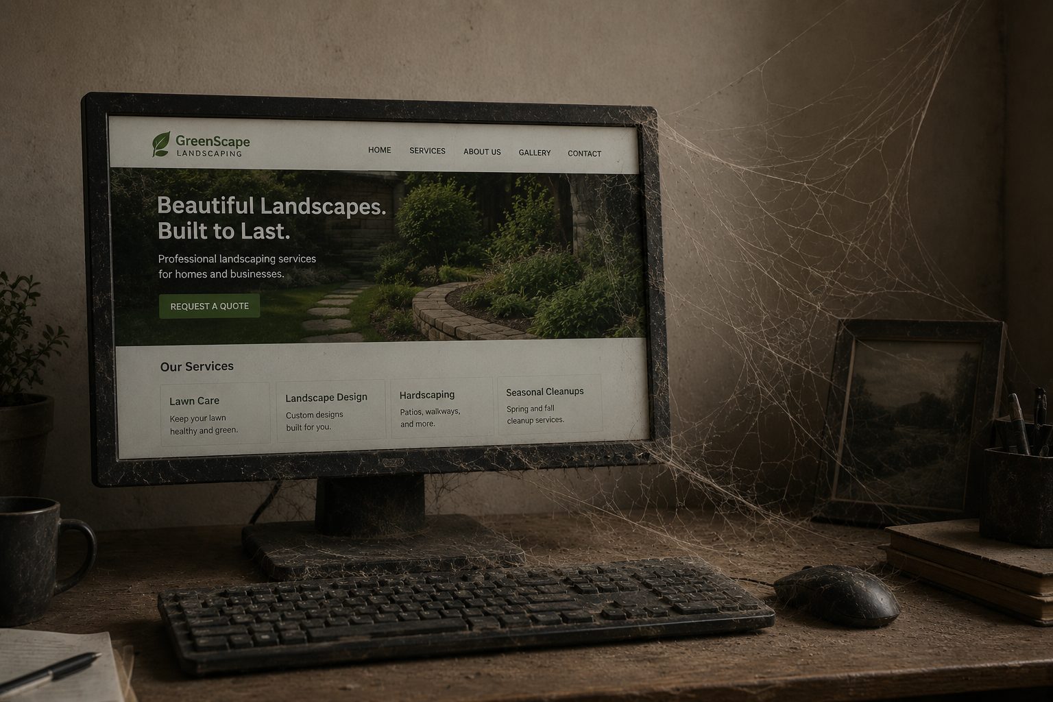
Outdated photos that date the whole site
A team photo from eight years ago. Products you no longer carry. A storefront you moved out of two leases back. Outdated visuals quietly undercut everything else on the page, because they suggest the business itself might be just as out of date.
Frequently Asked Questions
How do I know if my website visuals are hurting conversions?
Look at your bounce rate and how long people stay on your homepage. If they leave within seconds without scrolling, the visual first impression is the likely culprit. You can also ask a few real customers to click through and tell you how the site feels before they read anything, since that gut reaction is the thing your visuals are shaping.
Do I need professional photography for my website?
Not always. Well-composed photos taken on a recent phone, with decent lighting, will outperform poorly chosen stock images every time, because the goal is authenticity rather than production value. That said, if the budget allows, one professional session focused on your actual space and work is well worth it.
What is the most important visual element on a small business website?
The hero section, meaning the first thing visible before anyone scrolls. That image and headline together are your first handshake with a visitor, so get them right before you worry about anything further down the page.
Why do stock photos hurt trust?
People have seen millions of them, so the too-posed body language, the too-generic settings, and the too-polished models all register as borrowed rather than real. Eye-tracking research shows users tend to skip right past decorative stock images, and when a photo feels fake, it plants a small doubt about whether the rest of the business is genuine.
Can I fix this without redesigning my whole site?
Yes. Swapping out the hero image, replacing stock photos with real ones, and clearing visual clutter off the homepage can change how a site feels dramatically without touching its structure. Visuals are some of the most fixable problems a website has.
If your site looks fine to you but visitors are not converting, the images and layout are worth a hard, honest look. If you want a second set of eyes on what your site is actually communicating before anyone reads a word, reach out and we will tell you what we see.
Why Your Website's Stock Photos Are Giving Visitors "the Ick"
Here is a question that comes up more than you would think: why do dentistry ads always show flawless, perfect smiles instead of real patients with real teeth? The answer is revealing. Showing imperfect teeth makes the ad feel like it is about fixing something broken, even though fixing teeth is exactly what dentists do. The image ends up signaling shame instead of care.
That same misfire plays out on small business websites every single day. Your visuals communicate trust, competence, and personality before a visitor reads a single word. When the images, layout, and visual hierarchy are even slightly off, people decide to leave before they reach a sentence. This is less about having a beautiful website than about whether your visuals are quietly saying what you actually mean.
What Customers Decide in the First Few Seconds
People do not read websites. They scan, and the very first thing they take in is visual: the photos, the colors, the density of the layout, and whether anything feels obviously off. Research on first impressions consistently finds that visitors form a visual judgment in under a second, well before they have processed a word of your copy. That judgment has little to do with design taste and everything to do with whether the site feels trustworthy enough to keep reading. A few signals trip people up fastest.
Stock photos that do not match the business
This is the big one. A plumbing company fronted by models in spotless hard hats. A massage practice using generic spa images that could be any hotel chain. An accountant represented by a stock photo of a briefcase on a marble floor. Visitors recognize stock photography, even when they could not name what tipped them off.
The research here is unusually clear. Nielsen Norman Group's eye-tracking studies found that users completely ignore decorative "feel-good" stock images while genuinely studying photos of real people and real work. And Getty Images reported in 2024 that 98 percent of consumers say authentic images and video matter for establishing trust. So stock photos do not just fail to help. They actively work against you, because the moment a first impression feels staged or borrowed, people start quietly wondering what else about the business is fake, and they bounce. Authentic, specific imagery is one of the cheapest credibility upgrades you can make.
Low-resolution or compressed images
A blurry photo communicates one thing above all: nobody is maintaining this. If your image quality looks careless, visitors reasonably assume your service quality might be careless too. This is especially brutal on phones, where a low-resolution hero image fills the entire screen and becomes the whole first impression.
Visual clutter and competing elements
When everything on a page is fighting for attention at once, nothing actually gets it. A cluttered layout feels busy, hard to trust, and hard to act on, and visitors do not patiently sort through visual chaos to find the one thing they need. They leave and try somewhere calmer.
Showing What You Do, Versus Saying What You Mean
The dentistry question is really a deeper one: should your visuals show reality, or aspiration? The honest answer depends on what your customer is feeling when they land on the page.
Someone searching for a dentist is usually a little anxious already. A perfect, intimidating hero smile can quietly raise that anxiety, while a photo of a calm, welcoming office, or a real patient smiling in a way that reads as human, does more to turn that visitor into a booking. The same logic runs across service businesses. A remodeling contractor who shows a messy mid-project shot beside the finished result often builds more credibility than one who only posts glossy "after" photos, because it proves the work is real. A gym that shows actual members lifting, rather than fitness models, feels far more approachable to a nervous beginner.
So the question worth asking of every image on your site is not "does this show what I do?" It is "does this reflect how my customer wants to feel after working with me?" That small shift changes which photos you choose and how you frame them.
Four Visual Mistakes That Cost You Customers
No human faces anywhere
People connect with people. A site built entirely from products, services, and abstract imagery, with not a single human in sight, reads as corporate and cold. Even one genuine photo of you, your team, or a real customer in the middle of real work measurably warms up a page.
The hero image and headline are fighting each other
The image behind your headline should reinforce the message, not pull against it. A dramatic landscape photo sitting under the words "We do residential plumbing" creates a small disconnect that makes people hesitate, and hesitation is where you lose them. The visual and the words should be telling the same story.
Colors and fonts that signal the wrong industry
Design carries category associations whether you intend it or not. An accountant in neon green with a graffiti-style font signals something very different from steady and trustworthy. A children's tutor wrapped in a dark, corporate palette feels off-limits to parents. These are not hard rules, but when your design language reads as belonging to a different industry, visitors feel the friction even if they cannot name it.
Outdated photos that date the whole site
A team photo from eight years ago. Products you no longer carry. A storefront you moved out of two leases back. Outdated visuals quietly undercut everything else on the page, because they suggest the business itself might be just as out of date.
Frequently Asked Questions
How do I know if my website visuals are hurting conversions?
Look at your bounce rate and how long people stay on your homepage. If they leave within seconds without scrolling, the visual first impression is the likely culprit. You can also ask a few real customers to click through and tell you how the site feels before they read anything, since that gut reaction is the thing your visuals are shaping.
Do I need professional photography for my website?
Not always. Well-composed photos taken on a recent phone, with decent lighting, will outperform poorly chosen stock images every time, because the goal is authenticity rather than production value. That said, if the budget allows, one professional session focused on your actual space and work is well worth it.
What is the most important visual element on a small business website?
The hero section, meaning the first thing visible before anyone scrolls. That image and headline together are your first handshake with a visitor, so get them right before you worry about anything further down the page.
Why do stock photos hurt trust?
People have seen millions of them, so the too-posed body language, the too-generic settings, and the too-polished models all register as borrowed rather than real. Eye-tracking research shows users tend to skip right past decorative stock images, and when a photo feels fake, it plants a small doubt about whether the rest of the business is genuine.
Can I fix this without redesigning my whole site?
Yes. Swapping out the hero image, replacing stock photos with real ones, and clearing visual clutter off the homepage can change how a site feels dramatically without touching its structure. Visuals are some of the most fixable problems a website has.
If your site looks fine to you but visitors are not converting, the images and layout are worth a hard, honest look. If you want a second set of eyes on what your site is actually communicating before anyone reads a word, reach out and we will tell you what we see.